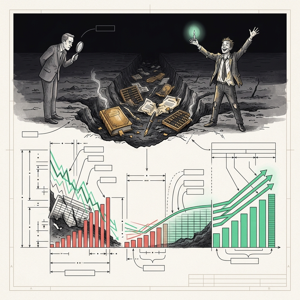
Burn multiple trending direction is the quarter-over-quarter change in a company's net burn divided by net new ARR, and investors use the slope of that line — not the current number — to decide whether a startup is compounding efficiency or coasting. Three consecutive quarters of improvement (for example, 2.4x → 1.9x → 1.5x → 1.2x) signals a business that is learning how to convert cash into revenue faster over time, and that trajectory is what unlocks Series B and beyond. A better spot ratio without direction is a snapshot; a worse spot ratio with a clean downward slope is a story investors will fund.
David Sacks introduced the burn multiple at Craft Ventures in 2020 as net burn ÷ net new ARR, arguing it was the single cleanest test of whether a startup was building an efficient growth engine or lighting money on fire. Six years later, the metric has become the default lens Sequoia, CRV, Scale Venture Partners, and every serious growth-stage investor use to open a board pack. But the working professionals actually running these companies keep making the same mistake: they optimize for the spot number in the quarter they're fundraising, and neglect the trend line that investors are actually staring at.
Why Burn Multiple Trending Direction Beats a Single Snapshot
Sacks himself has been explicit that the burn multiple should improve as a startup matures. In his original Bottom Up post, he framed the metric as a diagnostic — if it is trending in the wrong direction, "something is wrong, even though headline growth might still be increasing in nominal terms." That framing is critical. A company can post record ARR and still be a worse business than it was two quarters ago if it took disproportionately more cash to get there.
Consider two hypothetical Series B applicants, both at a 1.8x burn multiple in Q4:
- Company A: 2.4x → 2.1x → 2.0x → 1.8x. Three quarters of steady improvement.
- Company B: 1.2x → 1.4x → 1.6x → 1.8x. Three quarters of steady deterioration.
The spot number is identical. The stories are opposite. Company A is building leverage — every incremental sales rep, marketing dollar, and engineer is producing more ARR than the last. Company B is buying growth with capital, and the marginal dollar is producing less. Sequoia, per commentary from Scale Venture Partners' Getting to B series, has been explicit that Series B leads want to see a sub-1.5x trailing-twelve-month burn multiple with quarter-over-quarter improvement — the trend is a gating criterion, not a bonus.
Practical takeaway: Before you present your burn multiple to a board or investor, compute the last four quarters as a sequence, not an average. If the line isn't sloping down, you have a narrative problem the spot number cannot fix.
What the IPO Class Actually Showed Us
The clearest examples of trending-direction discipline come from S-1 filings, because they force multi-year capital efficiency disclosure. Meritech Capital's teardowns of the last cycle's benchmark IPOs are instructive.
Datadog, per Meritech's S-1 breakdown, had spent roughly $21M in cumulative net burn to reach approximately $332.9M in implied ARR at IPO — an implied capital efficiency of roughly 15.6x ARR per dollar burned. This is a business whose burn multiple was always improving, quarter after quarter, because it was fundamentally usage-based, product-led, and infrastructure-priced. By contrast, Snowflake's S-1, per PublicComps' teardown, showed roughly $800M in capital consumed to reach $532M in ARR — a much heavier burn profile that still cleared the IPO window because the trajectory in the trailing quarters was visibly improving and the growth rate was exceptional.
Klaviyo, in the quarters leading to its September 2023 direct listing, deliberately held sales and marketing spend roughly flat while ARR compounded, per Meritech's Klaviyo S-1 breakdown. The result: sales efficiency metrics like magic number softened, but the burn multiple direction was unambiguously toward zero — and the company ultimately posted its first quarter of GAAP profitability by Q1 2026. That trending direction, disclosed across sequential quarterly cohorts in the S-1, is what let public-market investors underwrite the listing at scale.
The pattern is consistent: the market rewards a visible slope, even off a mediocre starting point. It punishes flat or worsening lines even off strong absolute numbers.
The Three-Quarter Rule and Why It Exists
Why three quarters, specifically? Because that is the minimum window that filters signal from noise. Any single quarter's burn multiple is heavily distorted by one-time events: an annual contract that closes on the last day of Q4, a bonus accrual, a payroll timing shift, a large hosting reservation prepay. Two data points can be coincidence. Three consecutive improvements are a system.
CFO Advisors' 2025 Series A burn-multiple benchmark work makes the same point in reverse: they explicitly guide founders to build the board narrative around "quarter-over-quarter burn multiple improving by 0.1x or more" as a good trajectory signal. That 0.1x hurdle is small on paper — going from 1.8x to 1.7x — but sustained across three quarters it compounds to a 0.3x delta, and it is enough evidence to distinguish a business that is learning from one that is treading water.
Here is the step-by-step diligence sequence a serious growth investor runs on your data room:
- Pull the last eight quarters of net burn and net new ARR from your finance model.
- Compute the burn multiple per quarter (not trailing twelve months — the raw quarterly number).
- Plot the sequence as a line. Look at slope over the last four quarters.
- Overlay the ARR growth rate on a secondary axis. If burn multiple is improving and growth is holding, that is a leverage story. If burn multiple is improving because you slashed marketing and growth is collapsing, that is a survival story.
- Ask what changed in the operating plan between the worst quarter and the best. If you cannot name three specific operational decisions, the improvement is accidental — and accidents don't compound.
Practical takeaway: The three-quarter rule is not arbitrary. It is the shortest window that separates a real operating improvement from a lucky quarter. Build your metrics reporting cadence around it.
How to Actually Improve the Trend — Not Just the Spot Number
Investors have seen every version of the "we fixed our burn multiple by firing 30% of the sales team the month before the pitch" story. That collapses the current-quarter ratio, but the trend line reveals it as a step-function cut rather than a durable improvement. The improvements that survive diligence come from structural changes in unit economics.
The three levers that reliably bend the burn multiple curve, quarter after quarter, are:
- Net revenue retention (NRR) above 110%. Every dollar of expansion ARR from an existing customer is essentially free growth — no CAC attached. Klaviyo reported an NRR of 110% in Q1 2026, per its investor call. When expansion is doing 25-30% of your growth, your burn multiple improves without touching the sales budget.
- CAC payback compression. Moving payback from 24 months to 15 months means the same acquisition spend generates the same ARR faster, which shows up as a lower burn multiple within two to three quarters. This is where product-led motions (self-serve trial, usage-based expansion) do their real work.
- Gross margin expansion. Every point of gross margin improvement flows straight to net burn without any change in top-line growth. Consolidating cloud spend, renegotiating data vendors, and moving from bespoke to standardized implementation is unglamorous but directly bends the trend line.
Notice what is not on this list: layoffs, ad-spend freezes, or hiring pauses. Those tactics improve the spot number for a quarter or two, but the trend line flattens as soon as growth slows in response — which it always does. The Series B market in 2025 and 2026, per CRV's guidance to founders on how Series A investors evaluate burn, has become sophisticated enough to distinguish the two.
Practical takeaway: If you want the trend to keep improving through your fundraise and past it, invest in NRR, payback, and margin — not in one-time expense cuts. Model the quarterly burn multiple explicitly in your operating plan and treat 0.1x-per-quarter improvement as a KPI, not a happy accident.
Building the Board Slide That Actually Lands
The single most effective slide in a Series B board deck is a two-line chart: quarterly burn multiple on the primary axis, quarterly ARR growth on the secondary axis, eight quarters of history. If both lines are moving in the right direction — burn multiple down, growth flat or up — you are telling a compounding-efficiency story. If burn multiple is down but growth is collapsing, you are telling a triage story. Investors read the shape of the chart in about four seconds; the words on the slide are for the follow-up questions.
A defensible board slide should include the following elements, in this order:
- The eight-quarter burn multiple line, labeled with the current and trailing-twelve-month values.
- The eight-quarter ARR growth line as an overlay.
- Three annotations calling out the operational decisions that drove the biggest quarter-over-quarter improvements — for example, "Q2: shifted to usage-based pricing on Tier 2 SKU."
- A forward-looking dotted line showing the projected burn multiple for the next two quarters, tied to the operating plan.
- Benchmark shading: the Series B target band of 1.0x–1.5x per current 2025 market consensus, and the sub-1.0x zone for context.
This is exactly the kind of visualization a well-built spreadsheet model should produce on demand. If your finance team is manually recreating this chart in PowerPoint every quarter, you have a workflow problem — and a burn multiple problem hiding inside it.
The Ready-Made Template That Handles the Math
Modeling burn multiple correctly is not conceptually hard, but the accounting adjustments are where founders and finance leads consistently trip: what counts as "net burn" (operating cash flow minus one-time items, or something looser?), how to treat deferred revenue, whether to net out interest income, whether to smooth for quarterly ARR seasonality. A properly built SaaS financial model handles all of it — quarterly burn multiple, TTM, projected trend, board-ready charts — as a first-class output rather than a derived hack.
ModelStack's SaaS financial model and board reporting templates are built to produce exactly this view: an eight-quarter burn multiple sequence, benchmarked against the current Series A and Series B market, with the ARR overlay and the projected forward trend already wired in. The Excel template comes with worked examples, pre-loaded benchmarks, and step-by-step instructions for driving the improvement narrative into a fundraising deck. If you're preparing a board pack or a Series B raise in the next two quarters, having the trend chart auto-generated — rather than reconstructed manually every reporting cycle — is the difference between telling the right story and burying it.
Sources
- The Burn Multiple — Bottom Up by David Sacks (Substack)
- Applying the Burn Multiple to Marketplace Business Models — Craft Ventures
- Klaviyo IPO | S-1 Breakdown — Meritech Capital
- Datadog IPO | S-1 Breakdown — Meritech Capital
- Snowflake S-1 & IPO Teardown — PublicComps
- How Series A Investors Evaluate Burn Rate — CRV
- Getting to B: Running a Successful Fundraising Process — Scale Venture Partners
- 2025 Burn-Multiple Benchmarks for Series A SaaS Startups — CFO Advisors
- Burn Multiple (David Sacks): Formula + Calculator — Wall Street Prep
Related: Browse all VC & Startup Templates on ModelStack.
Get started with a free template
Download our free Unit Economics Calculator — no signup required.